Monday, 16 November 2009

Efficient Framing for House Plans


Fine Homebuilding has a new article on the future of framing house plans. For many years we have been framing houses basically the same way. And this way is not necessarily the most energy efficient or material efficient. The article makes the following recommendations to increase energy efficiency and to reduce material and labor costs at the same time:
  • use 2x6 wall framing at 24" o.c. (in lieu of 16" o.c.)
  • use 1" rigid foam insulation in lieu of traditional sheathing
  • eliminate headers where they are not necessary structurally - where they are necessary size them properly (it is common practice to use the same size header throughout)
  • eliminate all the corner framing - let the drywall hang loose or use clips
  • use header hangars in lieu of jack studs
  • eliminate one of the top plates
I happen to agree that all of these ideas are good energy savings tips. Some builders however would argue that they are not necessarily cost savings. For instance eliminating one of the top plates may complicate the drywall installation. Eliminating the wall sheathing means using other methods to ensure shear strength. So before you implement any of these ideas on your new house make sure you talk through the implications closely with your builder. I also suggest having a residential structural engineer look at your new lightly framed house to make sure it won't tip over when the big bad wolf blows on it.

You can see the entire fine homebuilding article at "The Future of Efficient Framing"


Friday, 13 November 2009

Design Challenge for a 2000 SF House Plan

Lately I have been getting inquiries for modestly sized new home designs that feature main floor master bedrooms. A search of the web reveals a gazillion main floor master bedroom plans - but most are massive or ugly or both. So I decided this might be a good opportunity to design a new plan fitting this unique need, and to illustrate for you a little bit of the design process at the same time. So let's get started.

The design process I use typically involves the following phases:
  • Programming
  • Schematic Design
  • Design Development
  • Construction Documents
Today we will start with Programming. Programming really means just identifying a list of functional needs and qualities that you would like to see in your home. I'll start with a list that reflects the kinds of requests I have been receiving.
  • Modest plan size - as close to 2000 square foot as possible.
  • Open floor plan - Living, Dining and Kitchen spaces very connected with each other.
  • Mudroom with space for hanging coats and sitting for putting shoes on.
  • Laundry space should be on the main floor.
  • A main floor master bedroom with walk in closet and bath. The bath should have a walk in shower, but not necessarily a tub (the days of the jacuzzi tub seem to be over).
  • Spaces that are functional, but not over sized.
  • A reasonable sized entry porch.
  • A screen porch with spaces for eating and sitting.
  • A main floor powder room.
  • Possibly a den or away room - if space allows.
  • An attached 2 car garage - possibly with some additional storage space.
  • 2 additional bedrooms on a second floor.
  • A shared bathroom for the 2 upstairs bedrooms.
  • A basement that could allow future expansion space.
  • Beautiful home but not overly complex. Should be reasonably economical to construct. The house plan should be simple, yet unique.
That's a pretty good list for now. But I wanted to leave room for your thoughts. So please feel free to comment. Did I miss anything? Throw your 2 cents in.

Next posting I will update the program with your relevant comments - and we'll see some initial design thoughts.

Friday, 6 November 2009

How to design a bay window!

I have had many clients in the past tell me they want a bay window. Sometimes I have been a bit reluctant to the idea because I have seen so many bad examples. The image below is a very typical example of the contemporary application of the bay. To me this just looks like they cut a hole in the wall and slapped on the window unit. It just doesn't look integrated.

Don't do this!
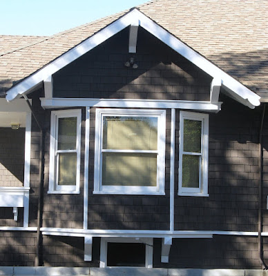
On the other hand my recent trip to the Napa Valley area reminded me that the bay window can be a beautiful design element when properly integrated with the architecture of the house plan. Here are a few examples on mostly craftsman style houses - all discovered in the town of Napa.

Square box bay instead of the typical angled sides. Simple shed roof with exposed rafter tails and supporting brackets. Shingle siding wraps the box out.

Here the bay walls simply extend up until they meet the roof overhang, which is deep enough to receive them. The continuous trim above the windows and the cedar shingles also help to integrate the bay properly with the house. The brackets below help to give the bay a sense of support.

Here is an angled bay window fitting below a square gabled form. This gable integrates with the house in much stronger way than our "don't do this example". Also note the small window below the bay. This completes the composition and reinforces the idea that the bay was not an afterthought.


My favorite bay window example in Napa. You can tell the designer spent a lot of time studying the form and detail to properly integrate with the house. Beautifully executed!