I have had many clients in the past tell me they want a bay window. Sometimes I have been a bit reluctant to the idea because I have seen so many bad examples. The image below is a very typical example of the contemporary application of the bay. To me this just looks like they cut a hole in the wall and slapped on the window unit. It just doesn't look integrated.
Don't do this!
 On the other hand my recent trip to the Napa Valley area reminded me that the bay window can be a beautiful design element when properly integrated with the architecture of the house plan. Here are a few examples on mostly craftsman style houses - all discovered in the town of Napa.
Square box bay instead of the typical angled sides. Simple shed roof with exposed rafter tails and supporting brackets. Shingle siding wraps the box out.

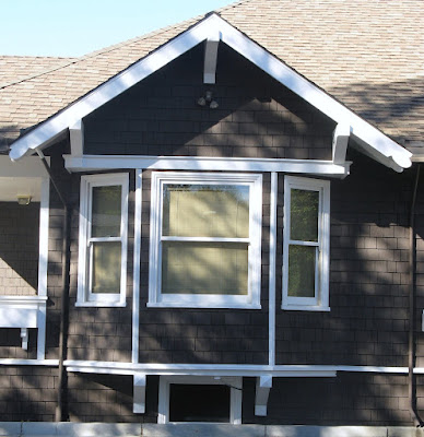
Here the bay walls simply extend up until they meet the roof overhang, which is deep enough to receive them. The continuous trim above the windows and the cedar shingles also help to integrate the bay properly with the house. The brackets below help to give the bay a sense of support.

Here is an angled bay window fitting below a square gabled form. This gable integrates with the house in much stronger way than our "don't do this example". Also note the small window below the bay. This completes the composition and reinforces the idea that the bay was not an afterthought.

My favorite bay window example in Napa. You can tell the designer spent a lot of time studying the form and detail to properly integrate with the house. Beautifully executed!

No comments:
Post a Comment