Friday, 31 December 2010

Design Ideas - Special Fireplace

I ran across this sculpture installation that really caught my eye.  A really simple fireplace wall composition with one spectacular piece of art.  The glass wheat sculpture is designed by Canlis Glass out of Seattle, Washington.  Check it out.


Simple composition of the fireplace wall.  A contemporary fire box and open display niche sit side by side.  Wheat sculpture centered above.

Lighting is important here as it really emphasizes the overall texture of the glass.

The stems of glass are set into the base of the sculpture; which in this case also serves as the fireplace mantel.

I don't want to know how much this costs.
I would imagine that this unique glass sculpture is cost prohibitive.  But the idea of the fireplace wall can be borrowed.  Keep the composition very simple.  No need for a fancy fireplace surround with expensive stone and and an ornate mantel.  Instead just place one interesting piece of art above.  Beautiful idea.

Wednesday, 29 December 2010

really modern really old house design

I ran across some photos of this house I thought interesting.  Actually, I love it.  The home located in Yport in Normandy, France was designed by Franklin Azzi Architecture in Paris.

I have for some time been very interested in the blending and contrasting of old and new - of traditional and modern.  Here the focal point for the design composition is a simple brick and stone box.  This emulates old fashioned rural farm structures that can be seen throughout the French countryside.  
The ends of the box have been completely opened up - providing access to a modern flat roof covered patio.  The design of the roof clearly contrasts with the gable form.

The rear of the home has a clearly modern "addition".  The gable form itself is repeated however the design clearly distinguishes itself from the traditional box.
Ridiculous views of countryside.  The roof deck we could never do in the USA because building codes would not allow it.  Someone could fall off.
Clean and simple interior bedroom space with exposed timber framework.  The old and new again coming together.

Monday, 27 December 2010

Ron Brenner Design to be Featured in New Book

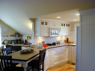
An In-Law Apartment I designed a few years ago is to be featured in an upcoming book by Michael Litchfield.  The book is called in-laws, outlaws and granny flats; and is slated to be available in bookstores and online by late February / early March.

the book can be pre-ordered at the taunton store - in-laws-outlaws-and-granny-flats

The book features a number of case studies that illustrate ways in which homeowners are creating in-law suites.  In our case study - called "Billys Place" we converted an existing garage attic space into a beautiful live able one room studio for Grandpa.

We used the volumes created by the shape of the roof and dormers to zone distinct spaces within.

The living, sitting and entry zones lie underneath the main gable.

The kitchen zone is carved into the northern dormer.
The bed zone lies within the southern dormer.
We at Simply Elegant Home Designs have created a couple of Garage / Studio Apartment designs inspired by "Billys Place".  If interested you can check them out with the links below:


Monday, 20 December 2010

New House Plan Offering - The Excelsior Cottage

Simply Elegant Home Designs is very proud to offer an amazing new house plan - the Excelsior Farmhouse Cottage; designed by Ron Brenner of Ron Brenner Architects.  The design combines elements from traditional farmhouse and contemporary cottage home styles.    

Excelsior Farmhouse Cottage - Front

Excelsior Farmhouse Cottage - Side / Rear

Excelsior Farmhouse Cottage - Living Room
This home plan’s exterior is characterized by this designer’s exquisite attention to scale, proportion, window patterns, materials and all of the details. A beautifully proportioned second story front gable and graceful columns provide a striking entry to the home.  Subtle overhangs with delicate brackets provide interesting shadow lines and help to protect the windows below.

The main floor accommodates kitchen, living and dining areas within its elegant open floor plan. Upstairs the three bedrooms, including the master suite, are neatly placed beneath an interesting roof line.  An above garage bonus room provides ample space for an additional bedroom and family flex areas.

You can visit Excelsior Farmhouse Cottage to learn more about this home design.

Thursday, 28 October 2010

Ron Brenner Architects creates new Cottage House Plan


Ron Brenner Architects is creating a new design for the Cottagewood division of Kyle Hunt & Partners. The design is characterized by a dramatic steep front gable roof line and will feature a modern open floor plan. Design refinements are still in progress but the video below illustrates its current state.


Cottagewood specializes in crafting Architect designed homes. They have created strategic partnerships with several Architects including Brenner to provide services for their clients. This design will be featured at their Palmer Pointe neighborhood in Minnetrista, MN.


I just thought I would give you an update on this design we are working on. We have done some "tweaking" of the exterior. The image below is the latest.

Thursday, 21 October 2010

Architects Suck?

I had quite a long conversation with a very nice fellow the other day. I’ll call him Tom, the owner of another pre-designed house plan company. His company specializes in the sale of architect designed houses that were originally designed for a real client. Anyways, Tom talks to people every day that are interested in purchasing his plans. Based on these conversations he believes that Architects have gained a bad reputation amongst the general public. Over and over again he hears a long list of complaints:
  • Architect did not listen to client
  • Architect ignored the construction budget
  • Architect ignored the design budget
  • Architect took forever to get anything done
  • Architect did drawings that were not “buildable
  • Architect is not cooperative with the builder
  • Architect does not communicate
  • Architect has “attitude”
  • Architects Suck!
All of this is a bit disheartening; but I happen to know the complaints are all too often true. I have heard similar complaints from the builders and contractors I have worked with. In my primary residential architecture business at Ron Brenner Architects we have taken on a fair number of new clients that came to us after having a bad experience with another Architectural Firm.
I am certain that none of my fellow CORA (congress of residential architecture) members fit into this “bad egg” category. But there seems to be a small component of the Architect family that does not put client first. We have a tough enough time out there without having to deal with a bad rep.

Solutions?
Most of us provide a great service for our clients and add value to their projects. We simply need to find more ways to get the good word out. Architects need to start generating some new ideas on how to do that.
I believe the internet is providing architects with more and more opportunity to reach out. One such example is Flickr. Here, Architects can post images of their projects, thus exposing more examples of good architecture to the general public. You might check out the CORA Flickr site which is beginning to post many good images of residential architecture.
You could also explore my own Ron Brenner Flickr site where I have posted images of projects completed by Ron Brenner Architects.

Saturday, 16 October 2010

New Simple Yet Dramatic Home Design

I just completed a new home design for a client that will be built in "Tapestry at Charlotte's Grove"; a new community in Lake Elmo, Minnesota.  This modern cottage house plan is a classic example of the kind of work I love to do.  Simple yet dramatic in form.  Clean detailing inside and out.  Open and connected spaces.  Efficient in it's use of space and relatively affordable to construct.  Here is a sneak peek at the exteriors.


Look for a variation of this design to be offered soon at  Simply Elegant Home Designs.

Wednesday, 15 September 2010

Home Design Ideas - Split the Garage!

At Ron Brenner Architects, I am currently working with a client on a new home design to be constructed in Rochester, MN.  Here we have run into a very common dilemma.  What to do with 3 1/2 cars worth of garage?   

If you put all of that garage to the side of the house you get one very wide plan.  If you put all of that garage forward of the house you get one very deep plan.  Many lots cannot accommodate either one of those plan arrangements.  So what I have proposed to do here is to split the garages into two separate structures.  The main two car garage is directly connected to the house via the mudroom zone.  The additional 1 1/2 car garage is placed on the opposite side of the lot; resulting in a nifty little entry court.  See sketches below.


Here you can see a birds eye view of the layout.  Notice the roof between the garage and house is low.  This helps to reduce the mass of the house.  Pulling the garages a bit forward of the front porch creates a nifty little courtyard.


view from street


view approaching courtyard

nice little composition

So when you develop your next house plan - please think about the impact of that garage and look for creative solutions.

Saturday, 21 August 2010

House Plans - Build it yourself

In the "old days" people used to build their own houses. Many would buy a set of house plans and the construction materials from the Sears & Roebuck Catalog; the pieces would get shipped to there home site and they would build it. Today there are Architect Designed Sears homes all over the country that were built in the early part of the 20th century. Here are a few examples.


This trend went away after world war II when the baby boom began. There was an enormous demand for housing and as a result developers began mass producing houses. One cookie cutter house after another.

Times are sure different now and I wonder if it is time to learn a bit from our past. The economy is tight and people don't have as much money to spend, but everyone still wants a nice home to live in. So why not start building our homes ourselves again?

I would never recommend that you literally go out and start framing your house. You would have to be very skilled and knowledgeable to take on that kind of effort. But depending on how handy you are and your level of confidence there are many ways that you can save money. Here are a few thoughts on things that you might consider tackling yourself:
  1. Be your own general contractor
  2. Build your own decks
  3. Install your own cabinets
  4. Install your own counter tops
  5. Perform all of your own painting (exterior and interior)
  6. Install your fireplace surround
  7. Do your own landscaping
  8. Install your own appliances
  9. Install your own patio or sidewalk pavers
  10. Install your own music system
  11. Build your own special interior staircase
  12. Install your own light fixtures
  13. Install your own bathroom accessories
On my own home I did at least some work in each of the above categories. My strategy was to let the professionals perform all of the critical work (foundations, framing, roofing, siding, etc.); but I would do the work that I was confident I could handle. I saved a bundle of money, which made my home affordable. Be warned however that this is a crazy amount of work for you to take on yourself. Many times you have to be available during normal work hours. And forget about having any kind of a life during construction. You will be at your job site every single night and weekend.

If you think you want to take on this kind of an effort you might start by finding a great architect designed house plan at Simply Elegant Home Designs.


Wednesday, 18 August 2010

Home Design Ideas - Funky Fireplace

You can learn much from studying rooms that you love. Below I have attached a living room picture from a home I designed a few years ago. This turned out to be a very calm and soothing space. I wish I were sitting there now!

A few key points:
  • Windows were placed on both of the outside walls of the space. I always try to have natural lighting feeding into a space from more than one direction.
  • Fireplace wall design was asymmetrical. Here form followed function. We needed a hideaway for the flat screen on one side, but not both. That left space for a cozy bench on the other side of the fireplace.
  • A funky half oval shaped fireplace was used. This adds a very unique detail to an element that is normally very predictable (the rectangular fireplace box).
  • Yellow walls with cream trim; natural wood floors and leather - the materials and colors are comforting.
  • Dark ebony stained trim is used sparingly to cap off the fireplace and media cabinet and at the stair railing. This adds richness and sophistication to the space.
  • Recessed lighting above highlights the details of the composition.
The moral of this story is - if you are looking to remodel a space in your home; find pictures of similar spaces that you love. Then study them to discover what it is about that space that makes it work so well.

Tuesday, 10 August 2010

Beijing Water Park Redux

This post is not about Home Design but I thought it interesting to pass on. Remember the National Aquatic Center at the Beijing Olympics? That's where Michael Phelps won all of that gold. So what do you do with your Olympic swimming pool inside a stadium when the festivities are over? If you are China you transform it into a huge Water Park.


The 77,000 square foot building Sports seven-storey slides, a wave pool, a water bar, rides entitled Aqualoop, Ridehouse, Bullet Bowl and Speed Slide, whirlpools and ‘deep-sea tornadoes.

Amazing Structure - Amazing Space!

Thursday, 5 August 2010

Home Design Ideas - Eclectic Kitchen

My better half (Kelley) sent me the kitchen photo below. She loves it and so do I.

Here are a few observations:
  • No upper cabinets - most of the storage is below counter height. I suspect there may be a pantry around the corner or pantry cabinets out of view.
  • Eliminating the upper cabinets allows plenty of glass
  • I like the mix of old and new. Actually its mostly new but a rather ornate crown molding and the carrera marble counters add a touch of traditional and soften the hard lines.
  • All of that counter space allows room for accessories to decorate the space. This starts to feel like another room rather than a kitchen.

Tuesday, 3 August 2010

Home Design Ideas - Floating Stair

Here is another nice home design idea - a floating stair. The residential design world tends to do things the same way over and over while commercial building design tends to be more experimental. Below is an example of an interesting floating stair that would be well suited to any contemporary / modern house plan.
The stair is supported be a series of steel stringers which span from floor to landing. By holding the bottom of the riser above the tread one gains the illusion of "floating". The flat wood paneling at the interior wall and the commercial grade "storefront" window system beyond add to the modern aesthetic.

So when you working with your Architect on the design of your new home, ask him / her to think about the details in a unique way. It is the details that will make your home truly special.


Sunday, 1 August 2010

Rambler Redux


I ran across some photos of a 1970's era rambler that was for sale in the San Francisco area. This reminds me that there is an awful lot of housing product that can be re-inspired.

I have seen so many try to turn a contemporary rambler into an arts and crafts home or some other more decorative architectural style. In this case the remodeling does not try to make the house into something that it is not. They simply build on the strengths of the design. Below are some pictures of the renovation.

nice fresh exterior


cabinets are a little traditional, but the overall aesthetic is still contemporary


simple space with contemporary furnishings. the dark wood floors contrasted with the light walls adds drama

Compare this house to so many 1950's through 1970's ramblers that you have seen. It makes you realize there is much potential in those old homes.


Tuesday, 27 July 2010

Design Ideas - Make Your Island Special!

This is the first in a new series that I will be starting called "Design Ideas". What I would like to do is illustrate little design ideas that can help to make your home special. So here goes.

The photo below is a Kitchen in a home that I designed at Ron Brenner Architects. This unique house plan - The Lakeland Cape Cod - is currently available for purchase at Simply Elegant Home Designs.
It is a pretty simple kitchen layout but a few things make it special.
  • The kitchen cabinetry composition beyond is kept simple and clean. A soffit with crown molding connects the upper cabinets to the ceiling.
  • A "mantle" was designed for the range, which serves as a counterpoint to the fireplace mantel on the other side of the room (not seen in photo).
  • Under cabinet lighting provides highlights for the tile back splash and counters.
  • An upper cabinet extends down to the counter and is fitted with glass to display the china.
  • A solid walnut butcher block on the island top adds warmth and richness. This contrasts with the honed granite kitchen counters beyond.
  • A special leg detail was designed for the island corners. The leg detail was also adapted for the stairway newel posts.
  • Unique eclectic light fixtures hang above the island; highlighting the wood and help to emphasize that the island is the focal point of the room.
All in all a very simple yet elegant kitchen design. This illustrates that attention to the details can make all the difference.

Sunday, 25 July 2010

Nice Space, Good House Design2

My better half (Kelley) loves everything that interior designer Candice Olson performs. I just ran across one more example of a family room she designed which I have included directly below.

It seems like all of her work combines architectural and decorating elements in a sophisticated and harmonious way. Here I love the texture of the fireplace wall, the comfortable mixing of old and new (furniture and accessories) and the attention to lighting.

Key point - lighting is one of the most important things that you should not overlook. In this room it highlights the texture in the wall, brings the warmth of the wood media cabinet out and creates subtle reflections on the metal storage boxes. The space would still be nice, but not nearly so dramatic without it.

Wednesday, 21 July 2010

Ipod Kitchen Faucet

For years I have been wondering when someone would come out with a kitchen faucet / ipod - and here it is!


OK - its not an IPOD, but a touch screen. The faucet is produced by Italian manufacturer Fima Carlo Frattini.

The "Nonos" faucet allows the user to adjust water quantity, pressure and temperature. It also alerts the user in case of any malfunction such as leakage. The faucet’s touch-screen and easy-to-read graphic icons help in controlling the flow and temperature of the water stream.


Tuesday, 20 July 2010

Nice Space, Good House Design

I ran across this photo of a nice modern bedroom space and thought I would pass it on along with a couple of thoughts.

  • Obviously the design is all about the connection with the outdoors. Floor to ceiling glass with a patio directly outside bleed the definition between outside and inside. If it was my design I might have extended the roof line outward to create a covered patio zone. This would have created a transitional space between inside and outside.
  • The room is nearly void of detail. Why distract from the view?
  • A very simple palette of material and color. The decorating takes a back seat to the outdoors.
So what's the moral to this story? If you have a beautiful yard take advantage of it. Spend more money on glass and patio / porch space and spend less by keeping the interiors more minimal.

Saturday, 17 July 2010

Custom Architect Designed House Plans for $10K?

So how much does good home design cost?

To have an Architect tailor a home design specifically for you and your building site it can cost quite a bit. Full service Architectural fees can cost anywhere from 8% to 15% of the construction cost of your home. As an example a $400,000 home could run from $32,000 to $60,000 in architectural fees.

Many clients however do not have the budget to accommodate those kinds of fees. So are there any alternatives to this approach?

  • You can spend countless hours searching through pre-designed house plans trying to find one that fits your needs.
  • You can try to find a residential designer that has lower rates (but you might sacrifice on design quality and creativity).
  • You can find a Residential Architect that has created a special package of services to provide a home design tailored for you and your site for around $10,000. This is exactly what we have done at Simply Elegant Home Designs.

We call this the $10k home design solution. We believe that anyone that is going to invest several hundred thousand dollars on a new home ought to have high quality design available to them; and that $10,000 is a reasonable investment that nearly everyone should be able to justify. Through our experiences working directly with many individual clients and builders we have identified the most important elements in the design process and what needs to be communicated in the drawings. We have taken our understanding of these most important elements and incorporated them (leaving out the fluff) into our $10K home design solution. Below is a brief summary of that package:

  • Program Review - This begins with a meeting where we discuss your building program in detail; your list of space needs, important adjacencies, interior and exterior aesthetic goals, views, site orientation and other site issues. Ideally we meet at your building site so we can get a feeling for the lay of the land together. Then we take what we learn and summarize it into our Building Program document. This serves as our guide for beginning the design of your home. For an example of a completed Building Program see the following link: Sample Building Program

  • Schematic Design - This is where we look at preliminary design solutions for your project. We will look at plan and exterior image sketches which describe possible options for the layout of your new home. After meeting with you to review the options we then refine them into one cohesive design that meets your needs. For an example of a completed schematic design see the following link: Sample Schematic Design

  • Construction Documents - This is where we put all the detailed pieces together which explains to the contractor the elements of the house so they can complete the bids and begin construction. As we prepare the construction documents we provide you with updated plans that are increasingly more detailed. This helps to ensure your complete understanding of the project. In the end we provide you with a concise set of plans, elevations, sections and specifications which together describe the project to your contractor. This is what they will build your home from. For an example of completed construction documents see the following link: Sample Construction Documents

The $10K Home Design Solution may not work for everyone. Because the fee is limited to this modest amount there are limits to building size and complexity of the design. To find out if this is the right solution for you give us a call at Simply Elegant Home Designs. Or call a good Residential Architect of your own choosing to see if they have a similar package available.


Saturday, 10 July 2010

Its Complicated House


Over the past year I have had several clients make reference to the movie "It's Complicated" starring Meryl Streep, Alec Baldwin and Steve Martin. They all love the house that Meryl lives in but cannot put into words exactly what it is that draws them. So I thought I would take a little closer look to see if I could discover the secret to this house.

The exterior of the home is very unassuming. Simple composition with handsome materials and elegant window patterns. The landscape is an important element to this homes exterior.


The foyer demonstrates the use of a simple material and color palette. Rustic wood and quarry tile floors, neutral plaster and painted trim. The dark windows add a level of sophistication. Also notice how the simple arches break down the length of the hallway.

A very simple but well proportioned composition of fireplace and bookcases. The wood beamed ceiling adds a coziness to a space that might otherwise feel too voluminous.

The kitchen is light, airy and very casual. Open shelving in lieu of cabinets. Wall mounted pot rack. Same earthy palette seen throughout the rest of the public areas.

The architecture of the bedroom remains neutral while the interior treatments liven up the space.


Subtle details add sophistication. The painted two toned wood floors and cabinets are unique.

To sum up this house I would say it has a very simple, yet sophisticated architectural theme both inside and out. Natural materials and color tones along with restrained decorating provide an overall soothing feeling. The home is at once casual and elegant - "casual elegance". It's a home that does not try to impress, but it does so anyway through it's subtleties. I can definitely see why people love this home.


Thursday, 13 May 2010

Architects Have Great Tools!

Every once in a while I like to give you an example of the tools we use in this business called Architecture. Things have come a long way since the old pencil and straight edge days. Now we perform all of our designs "virtually" using 3 dimensional computer programs. These programs allow an Architect to understand and communicate a design better.

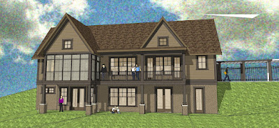
Below is an example of a design for a client that has been completed. But we are trying to get a better feeling for a potential color scheme. In this case my client had a few color schemes in mind. So I did a series of studies using "Sketchup" - one of our 3d modeling tools. This is a great way of testing a color scheme before you get committed to it.


These studies helped my client get comfortable (excited even) with her color choices.

So don't just use those little paint chip cards to make your final selections. Get your colored pencils out and test the scheme on one of your house elevations. Or better yet have your design professional test the color scheme using a 3d modeling tool like I do.