Wednesday, 30 November 2011

Architects Have Great Tools - Exterior Color Studies

At Ron Brenner Architects we have been working on a series of color studies for a client of ours.
I have included a number of the studies below.  The client has selected a medium gray for the base body color; however I also did a couple of non-gray variations.  The black roof is a given on all schemes.  Which one would you choose?
scheme 1 - all white horizontal clapboard siding

scheme 2 - gray board and batten siding, rusty corrugated metal inside porch and in 'link" area

scheme 3 - dark gray board and batten body color with white clapboard inside the porch and in link area

scheme 4 - gray board and batten body color with dark plum inside the porch and in the link area

scheme 5 - gray board and batten body color with white clapboard inside the porch and in the link area

scheme 6 - gray board and batten body color with dark gray shakes inside the porch and  in the link area

scheme 7 - gray board and batten body color with white shakes inside the porch and in the link area

Monday, 28 November 2011

Warm Air Rises

I received a question the other day pertaining to the image below.
"How much does it cost to heat a space like this?"
Great room view looking across dining, kitchen and living room.  The house plan can be purchased through Simply Elegant Home Designs at Hudson Simple Cottage House Plan   


Unfortunately there is no good way to answer this question.  There are simply too many variables involved; however I can give you one big generality.  Warm Air Rises and Cool Air Sinks - In the image above warm air will tend to rise towards the peak of the vaulted space.  Therefore, in warm climate regions high ceilings tend to be sought after because you don't want the heat near your body.  Conversely, in cold climate regions ceilings tend to be lower where you want to contain as much of the warmth as possible.

Warm Air Rises - Is one of the basic rules you should consider when designing an energy efficient house.  To me energy efficiency is the most important aspect to Green Design.  For more of my Green Design thoughts you might check out the following:
keep it simple 
top 10 green things to do

Thursday, 24 November 2011

Gobble!

"gobble"
happy thanksgiving
from simply elegant home designs

Saturday, 19 November 2011

cape cod with diamond shingles

I had an inquiry yesterday about the pattern shown in the upper portion of the gables in this house.  This home is a cape cod inspired design by ron brenner architects.

The entire house is clad in cedar shingles.  We used a semi-solid wood stain made by Cabot.  Sorry - I don't remember the specific color.  The grey shingles are contrasted with the linen colored trim and columns.

The diamond pattern is also created from cedar shingles with a custom cut.  This is a bit labor intensive, but provides a large design impact.  You can create many types of patterns using this technique, but I believe the diamond weave is elegant while remaining understated.  Note that I also projected the upper gable outwards to create a shadow line and provide a protective overhang for the windows.
This house plan is available for purchase at http://www.simplyeleganthomedesigns.com/Lakeland_Unique_Cape_Cod_House_Plan.html

Thursday, 17 November 2011

Houzz on Fire!

I was recently at the "Capture, Communicate, Create" event at the W Hotel in Minneapolis where Liza Hausman from Houzz was the featured guest.  If you have never heard of Houzz you should probably check it out.

Houzz is quickly becoming a leading destination site for home design enthusiasts.  It features over 200,000 high quality interior and exterior photos that have been uploaded by the original designers.  This makes Houzz the Internet's largest database of design and decorating ideas.


Houzz has a number of features for homeowners, but I think the coolest is that you can create your own ideabooks.  It's the modern day version of the old "cut and paste scrapbook" from magazines. Preparing to build a new home or take on a major remodeling?  Create an ideabook and share it with your Architect. In my own practice I love ideabooks because it helps me to understand my clients tastes and preferences. With this information I can design something new and fresh, but in a vein I know my client will love.

So do check it out.  You can view the Ron Brenner Architects Houzz page at http://www.houzz.com/ron-brenner-architects.  


And please don't forget to like us!

Saturday, 5 November 2011

traditional yet contemporary home design

Over at ron brenner architects I am doing some design work for new clients of mine.  They are looking for a home that blends the contemporary with the traditional; something that is both yesterday and today.  I presented the following three concepts.

A double gable scheme.  This form being familiar without being common.  

Shed on shed scheme.  Here I utilized a classic saltbox colonial roof form; blended with a more contemporary arrangement of windows and use of color.

Gable on saltbox scheme.  The full front gable is an unusual variation.  Side bumpout and "link" between house and garage is clad with metal

My clients were very happy with the alternatives.  In my next article I'll show you which scheme they chose; along with the developments we have made since then.


Which scheme do you prefer?

Monday, 10 October 2011

latest design by ron brenner architects

I just wanted to give you a sneak preview of a new home designed by ron brenner architects.  The new modestly sized home is illustrated below.

The design is a modern interpretation - blending elements from the classic american farmhouse and the arts and crafts. 

Ron had this to say about the home:  "The design process we use is always very collaborative.  In this case Mark Sova (from Main Street Builders) developed an initial concept floor plan.  We took that and performed a number of massing studies in order to determine the best possible form for the plan.  Then we developed a pleasing fenestration.  The result is a modern interpretation of a Midwestern Farmhouse".

Saturday, 1 October 2011

granny flat featured in forbes


A few years ago I (ron brenner architects) designed an above garage studio apartment for the father (grandpa) of a client of mine.  The apartment was featured in a new book called In Laws, Out Laws and Granny Flats.  I have included a couple of images here.

Now Forbes.com  has picked up on the idea.  Check out the article by Ashlea Ebeling at 10 Chic Granny Flats.  


Wednesday, 10 August 2011

House Plan Guru Creates New Concepts!

I received a call from a fellow a couple of days ago.  He told me that he has been exhaustively searching for house plans but cannot find one that fully meets his needs.  I always find  it amazing how many people have this problem given the tens of thousand of house plans available online.  But the fact is every client has individual needs.  Why should they settle for a house plan that comes up short?

His condensed building program is this:

  • 1 level home with walkout basement - walkout will initially be unfinished

  • 2 main floor bedrooms - one with en-suite - one using a shared public bath

  • walkout lot from front to rear

  • views of mountains at the rear of the house - rooms should take advantage of that

  • finished floor area  must be 1500 square feet or less 


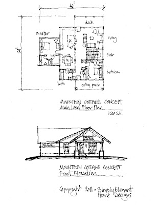
So based on his building program I sketched out a couple of concepts.  See below.


Spaces are spread across the width of the lot to take advantage of the mountain views.  Simple massing with one dominant gable form running from front to rear.  


A more compact arrangement with a "bungalow" inspired form.


This is one great example of the service we provide that sets us apart from our competition.  Can't find the right design solution?  Give our Guru (Architect) a call!
Simply Elegant Home Designs

Monday, 8 August 2011

New House Plan - The Willowbrook

Over at Simply Elegant Home Designs we will be coming out with a new design in the next couple of weeks.  Below is a sneak preview of our "Willowbrook".


Birdseye View


Main Level Floor Plan


Upper Level Floor Plan


Front Elevation - house left, entry and stairs middle, garage right.

Saturday, 6 August 2011

New Unique Small House Plan!

Simply Elegant Home Designs is introducing a new unique small house plan - "The Willernie Cottage" as illustrated below.  Architect Ron Brenner had this to say about the home:  "The design is definitely eclectic.  We combined farmhouse, shingle style, cottage and modern elements into a carefully composed exterior envelope. The interior layout is smart.  Like all of our designs we pay much attention to circulation patterns and potential furniture arrangements to ensure functional yet efficient use of space." 

Image from front

Main Level Floor Plan

Upper Level Floor Plan - Three bedrooms with two baths.

Front Elevation

Right Side Elevation
For more information on the home design you can follow this link:  Willernie Cottage

Sunday, 31 July 2011

New Home Design features Granny Flat!

Simply Elegant Home Designs is now offering a new house plan featuring an above garage "granny flat" apartment - The "Deephaven Eclectic Cottage".

Earlier this year one of my designs was featured in a new book called "In Laws, Outlaws and Granny Flats" (Taunton Press, by Michael Litchfield).  The book features ways that folks can add value to their homes by adding second dwelling units.  This seems so relevant to me given our current economic climate.  Therefore I decided to develop our first house plan that features a second dwelling unit.  The result is our "Deephaven Eclectic Cottage" - illustrated below.

Form is dominated by crossing gables punctuated with shed dormers.  Careful attention was paid to the scale, proportions and patterns developed by all of  the various building elements.


The apartment above is accessed by it's own entry at the back of the garage.  If desired the garage can also be segmented to provide a private parking zone for the apartment.  The main floor features gracious open living spaces and a wrap around front porch.  The screen porch is placed at the outside corner thus minimizing its impact on natural light and views from the spaces within.
Upper Level Floor Plan.  The apartment (above the garage) includes it's own kitchen, living, bathroom, eating areas and bedroom.  The apartment can also be accessed from the second floor of the main house.
"Black and White" color study - front elevation.  This demonstrates the simple yet sophisticated character of this home.
Rear Elevation
Right Side Elevation
All in all I think this is a really exciting new house plan offering.  More information on this home can be obtained at the following:  "Deephaven Eclectic Cottage".

Sunday, 22 May 2011

Custom Home Design - Craftsman Lake Home

I am working on a new home for a client through our  Custom Home Design  process at Simply Elegant Home Designs.  I thought I would give you a sneak peak of our initial concept sketches.  This is a 3 bedroom home to be constructed on a wooded lot overlooking a marvelous Minnesota lake.

Our design work always begins with plan sketches and 3d massing studies.  A 3d model beats exterior elevation sketches every time when trying to communicate a design.
Garage with bonus is left - entry link in the middle - main volume of house on the right.  A pretty straight forward concept designed to work with the topography of the land.
Above and below is an initial color study.  The client is looking for a home with an arts and crafts feel appropriate for  its wooded setting.  I'll typically do several color studies - so I'll pass those along as completed.

The custom home design process I have created provides a nice compromise between purchasing a pre-designed house plan and hiring a full scope of Architect's services.  This particular client had looked at thousands of plans online and could not find a design that worked.  On the other hand he did not have the budget to spend $30,000 or more on Architectural services.  Enter our custom home design process which fit the bill perfectly.

If interested in learning more about our Custom Home Design Services please feel free to contact Ron Brenner at 877-380-9470.

Saturday, 14 May 2011

Best House Plans - No Groupon Required!

Here at Simply Elegant Home Designs we are convinced that we offer the absolute best house plans in the business. To prove this point we are going to start featuring a “Home Plan of the Week”. The idea is to illustrate what makes our plans so special. Better yet, we will also offer a special discount for the featured plan for that week. And you don't even have to join Groupon!


Apple Valley Four Square
The Apple Valley Four Square is our first House Plan of the Week.

What makes this house so special? Let one of our recent clients explain through their testimonial.  I have excerpted portions below.

Yes, absolutely: feel free to share my delight in finding The Apple Valley Foursquare. It is a darling house.  We love the prairie schoolhouse vibe and the simple elegance of the exterior. As well, we appreciate the 2-sided light in each room. We are treating the entire staircase as a room - esp the landing at the top of the staircase with the large window that will overlook the center of the property: a meadow with Grandfather Oaks, the rushing winter creek winding through the far grove of fir trees. The Master Bedroom and screened porch will overlook the orchards, herb and vegetable gardens and if looking to the right, up the hill, we'll be able to see the small pinot noir vineyard.

I've had a chance to look over the .pdf doc - so fun to see how the house will be built - and the possibilities of an exercise room in perhaps a modified 1/2 basement option.  Love that!  (along with the machine room, storage and root cellar.) Also, it's funny - most of my furniture, mirrors, and key elements are from Pottery Barn, Room and Board, Restoration Hardware (neutral energy) and decor from Wisteria, home collection from Anthropologie (http://www.anthropologie.com/) and P Barn - design, textures and characteristics that will lend itself to the design of the house.

Ron, also the interior photographs of both the Deephaven Modern, and the Excelsior Farmhouse Cottage won our hearts over, too! The photographs are wonderful suggestions of lighting, color and carpentry for our own design.

The Den will be the Library - with to-the-ceiling bookcases, comfy chairs - a place to study and write.

Thanks so much,

We'll be in touch - L&K

PS - I've read
A Pattern Language and other books by Alexander Christopher (The Luminous Ground) and most of Sarah Susanka's books about "the not-so-big-house" including her Home By Design.  Also, Roots of Home by Russell Versaci and Michael Pollan's A Place of My Own. Add to that list William J. Hirsch's Designing Your Perfect House (Lessons From An Architect), and House by T. Kidder. Stacks of books! I've searched through Mascord, Garrell Associates, a whole bunch of architect's websites, purchased Designer Dream Home magazines at the market, created a vision board and pasted exterior and interior images into a journal, for years. It's not like I haven't done my homework!  Finally, we found Simply Elegant Home Designs and The Apple Valley Foursquare. Eureka!  We break ground this Spring. We're going . . Home.”
Now that is what I call a testimonial!

Tuesday, 22 February 2011

Home Design Ideas - 3 Tier Kitchen Island

A 3 Tier Kitchen Island is a simple Home Design Idea I have used many times over the years.  Most kitchen islands tend to be one tier or two.  On a single tier island one counter provides kitchen prep and eating / serving purposes.  On a two tier island one tier is the cooking counter and the second tier is the eating / serving counter.  I like to add a third tier because it adds another dimension and offers more storage possibilities.  See below for a few examples.

Three tiers - one for kitchen prep, one for eating and serving and one for storage.  Here we used glass doors for display.   I like the way the taller tier "anchors" the other two counters.  It also helps to define the edge of the kitchen from the hallway which is to the left.
Here (in our Excelsior Farmhouse) tiers on both ends "capture" the kitchen and eating counters.  The eating counter is highlighted with a natural walnut surface.  The taller end cabinets also provide another display surface.
Another simple example (from our Midwest Living Farmhouse) with a curved serving counter.  The taller end cabinets also help to conceal kitchen clutter from the living room beyond.  This is a good design strategy within an open floor plan.  


Saturday, 19 February 2011

The Value of an Architect 2 - Architects have great Tools!

A recent project I am working on at Ron Brenner Architects gives me another example of how a good designer can add value to a project. The home is in the Design Development stage, so the basic form and plan have been finalized but the details are still being adjusted. The images below illustrate how Brenner utilizes 3d visualization tools (in this case Google Sketchup) to study variations in design to communication options to the client. With better visualization the client is able to make more informed decisions.


The image above depicts the completed Schematic Design - a classic midwestern farmhouse exterior. Narrow gable forms, 1 1/2 story height, shed porches and box out bays, white clapboard siding, black shingle primary roof and galvanized metal porch roof.


This image depicts a taller plate height and a modification of the roof eave detail to provide more of a midwestern greek revival aesthetic.


Image above represents mostly a color study variation of the original farmhouse vernacular design but also makes subtle adjustments to column sizes and porch beam detail.

This last image depicts the concept of an "original" brick farmhouse being added on to with subsequent white clapboard additions.