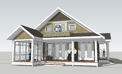
Tuesday, 22 February 2011

Home Design Ideas - 3 Tier Kitchen Island

A 3 Tier Kitchen Island is a simple Home Design Idea I have used many times over the years.  Most kitchen islands tend to be one tier or two.  On a single tier island one counter provides kitchen prep and eating / serving purposes.  On a two tier island one tier is the cooking counter and the second tier is the eating / serving counter.  I like to add a third tier because it adds another dimension and offers more storage possibilities.  See below for a few examples.

Three tiers - one for kitchen prep, one for eating and serving and one for storage.  Here we used glass doors for display.   I like the way the taller tier "anchors" the other two counters.  It also helps to define the edge of the kitchen from the hallway which is to the left.
Here (in our Excelsior Farmhouse) tiers on both ends "capture" the kitchen and eating counters.  The eating counter is highlighted with a natural walnut surface.  The taller end cabinets also provide another display surface.
Another simple example (from our Midwest Living Farmhouse) with a curved serving counter.  The taller end cabinets also help to conceal kitchen clutter from the living room beyond.  This is a good design strategy within an open floor plan.  


Saturday, 19 February 2011

The Value of an Architect 2 - Architects have great Tools!

A recent project I am working on at Ron Brenner Architects gives me another example of how a good designer can add value to a project. The home is in the Design Development stage, so the basic form and plan have been finalized but the details are still being adjusted. The images below illustrate how Brenner utilizes 3d visualization tools (in this case Google Sketchup) to study variations in design to communication options to the client. With better visualization the client is able to make more informed decisions.


The image above depicts the completed Schematic Design - a classic midwestern farmhouse exterior. Narrow gable forms, 1 1/2 story height, shed porches and box out bays, white clapboard siding, black shingle primary roof and galvanized metal porch roof.


This image depicts a taller plate height and a modification of the roof eave detail to provide more of a midwestern greek revival aesthetic.


Image above represents mostly a color study variation of the original farmhouse vernacular design but also makes subtle adjustments to column sizes and porch beam detail.

This last image depicts the concept of an "original" brick farmhouse being added on to with subsequent white clapboard additions.


The Value of an Architect

While at my regular job - Ron Brenner Architects - I received a phone call a few days ago. It was from someone who had been designing their own cabin. Subsequently the design was given to a builder who's draftsman tried to complete the design and drawings. Well it turns out that he did not like the design. He was still enamored with the floor plans, but not the exterior appearance. The image below is of the original design.
I was asked to see if I could take a shot at improving the appearance of the home without significantly altering the floor plans. He also wanted to maintain the basic chalet style roof line that he had started with. I agreed to work on an hourly rate basis to provide the services. I modeled the plan quickly in Sketchup and did several minor alternatives. In the end we landed on the final solution as shown below.


Hopefully this is illustrative of a little bit of value an Architect can bring to a project. They can turn an ugly duckling into a beautiful swan. Good design is not easy. It takes training, creativity and experience. There are many aspects of design that need to be considered including:
  • form
  • scale
  • proportion
  • rhythm
  • pattern
  • texture
  • shade and shadow
  • color
  • spatial qualities
  • quality of light
  • function
  • circulation patterns
  • furniture placement
  • construction related issues
  • cost / budget
A good experienced Architect will be considering all of the above while creating beautiful design solutions for you. So next time you decide to build a new home, or remodel an existing one; you really ought to consider hiring a design professional. Your project will be better off for it.


Tuesday, 15 February 2011

Home Design Ideas - Cozy Fireplace

Here is a another post from our Home Design Ideas category.  Create a Cozy Fireplace with an Inglenook layout.

Below is an interior remodeling of a home I did a couple of years ago.  The house was a classic 1950's Ranch - enclosed spaces, dark, uninviting.  As part of the remodeling we opened things up, brought in more natural light, and added a few more traditional details to the living room and other spaces.

The Living Room was the one large space in the house.  It was actually uncomfortably long which made planning an intimate furniture arrangement difficult.   So on with the Inglenook idea.  Think of an inglenook as a cozy kind of alcove space; which is exactly what we created.  See the pictures below.

The Inglenook was created by adding the new formal opening with columns just a few feet in front of the fireplace.  This served to shorten the room while still maintaining an open view to the fireplace.  In fact it even strengthened the fireplace as the focal point in the room.  

On either side of the fireplace we crafted a bench with recessed bookshelves above.  Detailing of the fireplace surround, paneling and columns is a spare level of traditional.  Color tones are subtle allowing the natural wood floor and brick fireplace to stand out.
All in all we were successful in creating the type of space our client was looking for - Simple, Unique and Elegant.

Copyright 2011 Simply Elegant Home Designs

Monday, 7 February 2011

Home Design Ideas - Squatty Front Door!

Here is a Home Design Idea for you - Buy a Squatty Front Door!

I had someone call me yesterday looking for some advice (not one of my own clients).  She told me that her house is in construction, and she is very concerned about her front door.  "The framed opening for the front door looks out of proportion - it looks squatty".  The door was to be about 40" wide x 6'-8" high, but she is now uncomfortable with her decision.  I could actually feel her agonizing over it.

I told her that the proportion of the door may in fact look squatty now, but might not once the door is actually in place.  That's because the door has paneling, details and textures within it that begin to visually alter it's own proportions.  You also need to look at the door in context with it's surroundings because it needs to be in balance with the overall composition.  I have a feeling she is just staring at the door opening only, which is a common issue amongst homeowners during construction.  This is where a good design professional could help her gain confidence in her decisions.

Here is a Cape Cod style house plan I designed with a "squatty" front door.  3'-6" wide x 6'-8" tall.  Looking at the door in context with the surrounding composition, it feels about right.

The vertical paneling treatment, vertical wood grain pattern and the dentil detailing below the glass all conspire to break down the visual width of the door.  The result is a "squatty" door that does not feel so.
So the moral of this particular story is twofold:
  1. Always consider design issues in their full context.
  2. Hire a design professional.  He / she can save you much agony.

PS - The Cape Cod House Plan illustrated here is available for purchase at  Lakeland Cape Cod

Tuesday, 1 February 2011

Worlds Best Small House Plan Introduced!

The Worlds Best Small House Plan has just been introduced at Simply Elegant Home Designs!
The home design - the Scandia Modern Cottage is actually a plan that Simply Elegant has had on the market, but has taken on a complete remodeling.  The result is the worlds best small house plan.  See images below and be sure to check out the videos.

A modest interior, but with abundant natural light and a carefully designed open floor plan it fills large.  Check the interior video out at small modern cottage interior 


The exterior is simple and unique.  A modern cottage design.  Check out the exterior video at small modern cottage exterior

The Scandia Modern Cottage was designed by Minnesota Architect Ron Brenner.  He had this to say about the project.

Is the claim that this is the worlds best small house plan a little much? Perhaps; but I am very excited about the design.  To me the design if fresh and the floor plan functions beautifully.  Let me list just a few things that I think make this a special home design.
  1. At 1349 square feet the home is on the small side, but it feels large. Take a look at the interior images and video and I think you will agree. We opened up the floor plan and looked carefully at circulation patterns and furniture arrangements to make the spaces highly functional. Windows filter the public spaces with natural light from every direction.
  2. It is a small house plan with plenty of storage. Because of it's size we made sure we packed it with storage possibilities in creative ways. A custom buffet cabinet floats between the living and dining areas. A continuous window seat with storage below is placed alongside the entry path. Media cabinets flank the fireplace.
  3. The house is “comfortable”. Both inside and out, it evokes a casual kind of elegance that makes you feel at home.
  4. The floor plan is adaptable. We have designed the home to be expandable with a main floor master bedroom. Or on a walkout or lookout lot, kids bedrooms could be placed on the lower level and the second floor converted into an amazing Master Suite.
  5. The exterior is adaptable. We like the clean lines and uncluttered look of it's Scandinavian influenced exterior. But the design can easily be adapted to a more traditional or rustic aesthetic without altering the massing in any way.”


View from rear yard showing the trellis covered patio area.

View from right side.  The tower makes a dramatic statement.


Custom cabinetry is featured throughout the home design providing for ample storage in a small house plan.  Also, notice the exposed stair stringers.