Saturday, 29 January 2011

Modern Cottage House Plan Update - The Afton

Simply Elegant Home Designs has updated the design of our Modern Cottage House Plan - The Afton.  We liked the old design for it's modern simplicity, but wanted to provide a fresh version for those with a bit more traditional sensibilities.  I've highlighted some of the changes below.

BEFORE
Here is our previous design.  Nice - so we just wanted to add a few touches to make it a bit more traditional.

AFTER
The new front elevation.  We added a an "eyebrow roof" above the wrap around porch, added muntins to the windows and changed the color tones of the exterior.  These changes give the home design a more soothing feeling and give it more of a beach cottage aesthetic.  By the way you can check out an exterior animation at Modern Cottage Exterior Video
View from rear yard.  We added a wrap around porch that connects to the screen porch.  This is a great home plan for outdoor living


Interior image from dining area through kitchen to living room.  We updated materials and color tones.   And we have added a great video that walks you through the main floor spaces.  You can check that out at Modern Cottage Interior Video
 All in all I think you can see that a few subtle changes can make a significant difference in a home design.  So let us know if you think.  Do you like the "before" or the "after"?

By the way - you can see more information on this plan at Modern Cottage House Plan! 

Thursday, 27 January 2011

Home Design Ideas - Crazy with Tile!

I recently ran into a photo of a simple bathroom design that I wanted to share with you.  It's a really skinny, small, simple, unique and fantastic powder room within a 1910 Georgian Mansion in San Francisco.  Check it out below.
This powder room is a contrast of the very modern and the very ornate.  It starts off as a very spare space with almost awkward proportions.  Add to that the modern wood vanity, vessel sink and faucet.  This is contrasted by the "crazy" - but well designed tile pattern, reinforced by the stained glass window and the ornate mirror. 
Detail view of the tile pattern.  I cannot imagine the man-hours that went into this.   But you have to admit it's very cool.
All in all a very quirky but beautiful powder room.  So todays lesson is this:
  1. Keep it simple but pay attention to the details.
  2. A contrast of styles can be very dramatic.


If you want to learn more about this bathroom you can check out the link where I found it:
http://arizonafoothillsmagazine.com/in-house/design-and-architecture/san-francicso-decorator-showcase-features-marsh-clark-powder-room

Saturday, 22 January 2011

Home Design Ideas - Drop the Ceiling!

My design philosophy is all about getting big design impact from simple ideas.  After all good design ought not to be expensive.  So here is a simple trick that I have been using for years - "Drop the Ceiling".  Take a look at the examples below and I think you will agree.  Simple Idea - Big Impact!

Here I added a gypsum board "bulkhead" to help define the spaces on either side of the kitchen.  Making the walls extra thick allowed space for ductwork in this otherwise wide open floor plan.
This home design offered for sale at Deephaven Modern Cottage
Here is the same bulkhead idea as seen from the dining area.
This home design offered for sale at Deephaven Modern Cottage

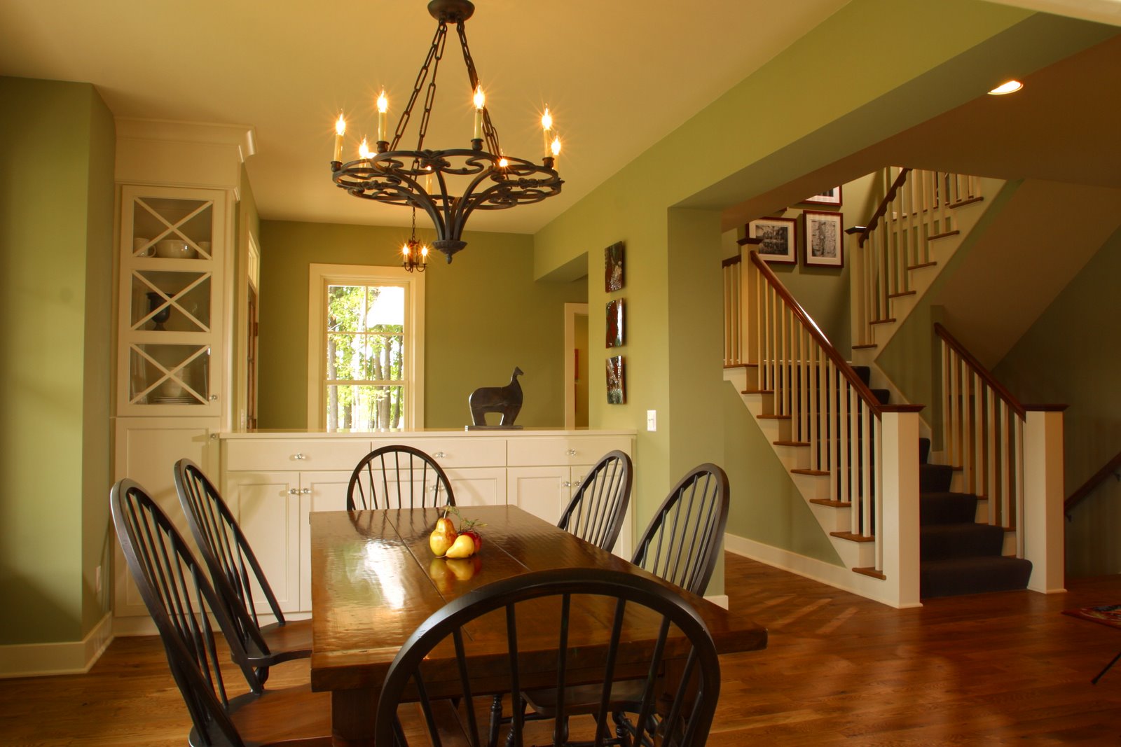
In this home I again utilized the dropped ceiling theme to define the space between kitchen and dining.  Here the client wanted a little more segregation of the spaces, so we crafted a beautiful buffet cabinet and anchored it at the bulkhead.

Here you can see a subtle drop in ceiling above the foyer.  The crown molding and color tone differences help to emphasize the edges of the space.
This home design offered for sale at Lakeland Cape Cod

Similar to above we positioned dropped "soffits"along the circulation lines between rooms.  Simple gypsum board "columns" marked the corners of the spaces.  We took advantage of the soffits by placing the main ductwork runs within.
This home design offered for sale at Apple Valley Foursquare

Saturday, 15 January 2011

New Unique Ranch Plan

Simply Elegant is now offering a new unique ranch house plan.  The "Somerset Ranch" offers a modern open floor plan, a main floor master suite and a generous front entry porch.  This modern Ranch with it's clean lines and careful attention to detail is definitely not your parents Rambler.  Check it out!

View of Entry Court.  Dormers filter natural light down into the vaulted living room and master bedroom spaces.
Nicely organized floor plan - a hallmark of Simply Elegant Home Designs.  Three additional bedrooms are located on the walkout basement floor.  This layout is ideally suited to "empty nesters" or families with tweens.

Front Elevation - Careful attention to proportions.  Clean and simple lines.  Also notice the transparency through the windows.  
Left Side Elevation.  Designed for a walkout lot.  The stone base wraps the entire footprint.

Rear Elevation - Abundant glass to take advantage of rear yard views.  The screen porch is smartly placed to the side so as not to obstruct.


All in all a very New and Unique Ranch House Plan available from Simply Elegant Home Designs.


Friday, 7 January 2011

Green House Plans Gone Wild!

Green is the big thing now in the design world and the house plans business.  I recently ran across these images of Icelandic houses that definitely take green to the next level of meaning.  Check them out below.

I love the repeating simple gable roof forms.
Grass grows nicely in Iceland.  Remember Iceland is green and Greenland is white.
The details exhibit a strong Scandinavian design influence.
Wow!

Monday, 3 January 2011

Architects Have Great Tools - Color Visualizer

Every once in a while I like to give you an example of the tools I use in my business.  One of these tools is the
Sherwin Williams Color Visualizer.  I use it to perform quick color studies; which helps me to narrow concepts down pretty quickly.

The tool is pretty simple to use.  You just choose from one of their preloaded exterior architectural styles; then you paint the scene with colors that you choose from the Sherwin Williams palette.  Below is one set of color studies I performed in less than five minutes.


When it's time to repaint your house you might give this tool a try.  You can find it at Sherwin Williams Color Visualizer.  


One important note:  Please put a good size sample up on your wall before you make a final commitment to your colors.  One additional step I do at Ron Brenner Architects and Simply Elegant Home Designs is to take my colors and apply them to my 3d house model.  You can see an example of that at Architects Have Great Tools!


Friday, 31 December 2010

Design Ideas - Special Fireplace

I ran across this sculpture installation that really caught my eye.  A really simple fireplace wall composition with one spectacular piece of art.  The glass wheat sculpture is designed by Canlis Glass out of Seattle, Washington.  Check it out.


Simple composition of the fireplace wall.  A contemporary fire box and open display niche sit side by side.  Wheat sculpture centered above.

Lighting is important here as it really emphasizes the overall texture of the glass.

The stems of glass are set into the base of the sculpture; which in this case also serves as the fireplace mantel.

I don't want to know how much this costs.
I would imagine that this unique glass sculpture is cost prohibitive.  But the idea of the fireplace wall can be borrowed.  Keep the composition very simple.  No need for a fancy fireplace surround with expensive stone and and an ornate mantel.  Instead just place one interesting piece of art above.  Beautiful idea.