Tuesday, 1 December 2009

Small Metal Cottage House Plan

Over the past year I have seen many tiny house plans designed by Architects. These plans are mostly experimental, intended to stretch the envelope and catch some buzz. I would however not be able to characterize most of these plans as live-able however. See my posts New Small House Plan Available Today! and New Tube House Lands From Outer Space! for instance.

But here comes a very small home design by Architect Toyo Ito and Associates that I might be able to see used as a second home, or a first home for a single or young couple. It is out there a bit with it's metal skin and modern shape. But inside is a workable studio plan that can accommodate living, cooking, eating and sleeping. The extensive use of wood really warms up the interiors. And an entire wall of glass brings the outdoors in.


By the way - if you are looking for real honest workable house plans check out the following:


Monday, 16 November 2009

Efficient Framing for House Plans


Fine Homebuilding has a new article on the future of framing house plans. For many years we have been framing houses basically the same way. And this way is not necessarily the most energy efficient or material efficient. The article makes the following recommendations to increase energy efficiency and to reduce material and labor costs at the same time:
  • use 2x6 wall framing at 24" o.c. (in lieu of 16" o.c.)
  • use 1" rigid foam insulation in lieu of traditional sheathing
  • eliminate headers where they are not necessary structurally - where they are necessary size them properly (it is common practice to use the same size header throughout)
  • eliminate all the corner framing - let the drywall hang loose or use clips
  • use header hangars in lieu of jack studs
  • eliminate one of the top plates
I happen to agree that all of these ideas are good energy savings tips. Some builders however would argue that they are not necessarily cost savings. For instance eliminating one of the top plates may complicate the drywall installation. Eliminating the wall sheathing means using other methods to ensure shear strength. So before you implement any of these ideas on your new house make sure you talk through the implications closely with your builder. I also suggest having a residential structural engineer look at your new lightly framed house to make sure it won't tip over when the big bad wolf blows on it.

You can see the entire fine homebuilding article at "The Future of Efficient Framing"


Friday, 13 November 2009

Design Challenge for a 2000 SF House Plan

Lately I have been getting inquiries for modestly sized new home designs that feature main floor master bedrooms. A search of the web reveals a gazillion main floor master bedroom plans - but most are massive or ugly or both. So I decided this might be a good opportunity to design a new plan fitting this unique need, and to illustrate for you a little bit of the design process at the same time. So let's get started.

The design process I use typically involves the following phases:
  • Programming
  • Schematic Design
  • Design Development
  • Construction Documents
Today we will start with Programming. Programming really means just identifying a list of functional needs and qualities that you would like to see in your home. I'll start with a list that reflects the kinds of requests I have been receiving.
  • Modest plan size - as close to 2000 square foot as possible.
  • Open floor plan - Living, Dining and Kitchen spaces very connected with each other.
  • Mudroom with space for hanging coats and sitting for putting shoes on.
  • Laundry space should be on the main floor.
  • A main floor master bedroom with walk in closet and bath. The bath should have a walk in shower, but not necessarily a tub (the days of the jacuzzi tub seem to be over).
  • Spaces that are functional, but not over sized.
  • A reasonable sized entry porch.
  • A screen porch with spaces for eating and sitting.
  • A main floor powder room.
  • Possibly a den or away room - if space allows.
  • An attached 2 car garage - possibly with some additional storage space.
  • 2 additional bedrooms on a second floor.
  • A shared bathroom for the 2 upstairs bedrooms.
  • A basement that could allow future expansion space.
  • Beautiful home but not overly complex. Should be reasonably economical to construct. The house plan should be simple, yet unique.
That's a pretty good list for now. But I wanted to leave room for your thoughts. So please feel free to comment. Did I miss anything? Throw your 2 cents in.

Next posting I will update the program with your relevant comments - and we'll see some initial design thoughts.

Friday, 6 November 2009

How to design a bay window!

I have had many clients in the past tell me they want a bay window. Sometimes I have been a bit reluctant to the idea because I have seen so many bad examples. The image below is a very typical example of the contemporary application of the bay. To me this just looks like they cut a hole in the wall and slapped on the window unit. It just doesn't look integrated.

Don't do this!
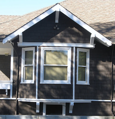
On the other hand my recent trip to the Napa Valley area reminded me that the bay window can be a beautiful design element when properly integrated with the architecture of the house plan. Here are a few examples on mostly craftsman style houses - all discovered in the town of Napa.

Square box bay instead of the typical angled sides. Simple shed roof with exposed rafter tails and supporting brackets. Shingle siding wraps the box out.

Here the bay walls simply extend up until they meet the roof overhang, which is deep enough to receive them. The continuous trim above the windows and the cedar shingles also help to integrate the bay properly with the house. The brackets below help to give the bay a sense of support.

Here is an angled bay window fitting below a square gabled form. This gable integrates with the house in much stronger way than our "don't do this example". Also note the small window below the bay. This completes the composition and reinforces the idea that the bay was not an afterthought.


My favorite bay window example in Napa. You can tell the designer spent a lot of time studying the form and detail to properly integrate with the house. Beautifully executed!

Saturday, 31 October 2009

Old simple house plans - design inspiration

I posted an article the other day on gaining inspiration from old houses. Below is another great example - a bungalow that I stumbled upon near Forestville, California. It is so simple yet so well done. Why aren't builders and designers creating more homes like this anymore? Has the idea of doing a modest, simple and well detailed home escaped them? There must be a niche for this kind of house plan, but perhaps it's a lost art.

So here is the brilliant idea:
  • keep the overall form and roof line very simple - this costs less to build
  • use nice deep overhangs - this protects the walls, windows and doors from the elements
  • create a good composition of windows - here picture windows are combined with double hungs and centered between the porch columns and the wall surfaces
  • use minimal ornamentation - the window grid patterns and the exposed rafter tails are pretty much the extent of it here
  • create a focal point - the simple shed dormer with louvers and the stair that is "captured" with side walls helps to create a center line and create focus on the entry
  • give the house a base - the white clapboard siding provides a platform for the house to sit on and it contrasts nicely with the red shingle siding.

Thursday, 29 October 2009

Finding Design Inspiration in Old Houses

My better half and I just got back home from a short trip to the Napa Valley area. We don't really go for the wine, although that's nice too. For us it is really about the scenery. The area really has such a subtle beauty that we just love. On our trips I of course like to see the local architecture. I try to take snap shots of things I see that I might draw some inspiration from later on. Anyway I thought I'd show you an example from this recent trip and illustrate what I am trying to learn.
Here is a snap shot of the gable end of a historic home (the Kelley house) in Mendocino. I love the simplicity in form and the strength of it's details. This is a key to good design. If you have a simple form you need to pay attention to the details. Here are my thoughts:
  • The proportions of the gable are quite nice - neither too slender or too squat with roof pitch neither too steep or too flat.
  • I love the depth of the gable end roof overhang (this is called the rake end). The brackets underneath provide a sense of support for the overhang.
  • The crown molding at the fascia creates additional shadow line and adds a subtle detail.
  • A wide frieze board (that's the white trim on the wall below the overhang) provides a nice transition between the siding and roof overhang.
  • The siding lap is nice and narrow. The proportion of the entire gable would be altered if the siding had a wider lap.
  • I like the narrowness of the windows, and the fact the pair of windows are separated. Look closely and you can see a subtle little "pilaster" detail at the jambs and mullion. Also the trim at the head projects outward creating additional shadow line and interest.
  • One thing I don't care for here is that the upper windows are nearly identical to the lower windows. I would rather see a bit of hierarchy - with the lower windows being a bit larger and more detailed than the upper windows. Another thing that bothers me slightly is the upper window intrudes upon the frieze board. It looks a little "crowded".
All in all it's a very pleasant composition and I can take away some good thoughts that I can apply on a future design.

Friday, 23 October 2009

New Dutch Colonial House Plan Unveiled!

Simply Elegant Home Designs has just made the "Tonka Dutch Colonial" house plan available for purchase. The home was designed by Ron Brenner in Stillwater, Minnesota. Ron Brenner; who has been featured in a number of National and Regional publications has gained a reputation for designing charming and functional modestly sized homes. You can obtain more information on this house plan by visiting the following link:

Monday, 19 October 2009

Revit House Plans

It's taken me a while but I am really convinced that Building Information Modeling (BIM) is the greatest thing since sliced bread. Traditionally buildings have been drawn using 2 dimensional CAD technology - or by hand drafting. But with BIM you create a 3 dimensional "virtual" model of the building. In order to communicate the design to client and contractors you then generate various views from the model (plans, elevations, sections, etc). I'll show you an example of how this works below.

Here you can see an axonometric view of the 3 dimensional model of this house plan. The model was created using REVIT software, by Autodesk.
Now I have "sliced" a view from overhead looking down onto the plan. What is great here is you can see the relationships between the various elements (windows, doors, trim and even furniture) so that you can better evaluate the design.


Here is another sliced view, but this time from a side. You can see the roof, ceilings and the decorative trusses.

The section below is just another "slice" taken from the model. The walls, floors roof and ceiling profiles are all in precisely the correct position. To make it into a construction drawing you just need to add the pertinent detailed information.

Here the virtual model has been exported into Google Sketchup, which is a great design tool. In this case all I did was added the materials, colors and a little entourage. Isn't this a better way to convey the interior design concept?
All images above are of the "Hudson Cottage" house plan which is available for sale at Simply Elegant Home Designs.


It takes a while to learn and become efficient at BIM. But in the end I am convinced it is a better way to understand your design, a better way to communicate the design and a better way to assemble the construction drawings.

Thursday, 15 October 2009

Afraid of Color?

apartment therapy - an interior design blog is having their fifth annual contest called "Room for Color 2009". In October they are looking for the most colorful, beautiful room on the planet.

It's a good idea because adding color is one of the most affordable ways of changing a rooms character. But many of the folks are afraid of using color. Well as you can see from the examples below some of these folks really are not afraid at all.


photos courtesy of apartment therapy

You can see more entries at Room for Color. Check it out - you'll find lots of ideas. Some bold and crazy; and some simple yet sophisticated.


Wednesday, 14 October 2009

Housing Industry Needs to Reinvent

The housing industry (builders and designers) is in dire need of a new system / approach to building. I'll list a few reasons here:
  • Construction costs and land / development costs have gotten out of control in recent years.
  • The housing bubble has dramatically dropped the value of our homes.
  • The fact right now is that you cannot build a new home inexpensive enough to compete with the glut of existing homes on the market.
  • If we are seeing an economic recovery it's a small one - and the job market is not expected to improve for several years.
  • New buyers are having difficulty getting loans or do not qualify for enough loan to build the kind of house they might have a few years ago.
  • Home buyers are becoming much more aware of "value".
  • Home buyers are increasingly environmentally conscious.
  • Home buyers are more "hip" and expect good design and construction quality.
So what the people want is a really cool, sustainable, well constructed cheap house. Is anyone out there providing that? Or is this an impossible combination?

Indeed, times are tough and it is truly a time of survival of the fittest in the housing market. The housing industry needs to pull their collective head out of the sand and adapt. I believe that the industry needs to look at things fresh and perhaps create an entirely new business model.

In looking for new ideas I have looked to old ones. What about the old days when a fellow purchased a house from Sears Roebuck Company? The house was shipped to them and they built it themselves, or had local tradespeople construct it. Why did that business model go away? One reason I think is because people stopped being handy. They no longer had the skills to put anything together as complicated as a stick framed house. Even if they could it would take forever; and banks don't like that.

Enter a new system devised in Germany called HIB. HIB is a building block system that goes together like Lego's. They say that the simplicity and speed of putting the system together makes it an ideal candidate for an owner built project. The company also touts the product's insulating capabilities, sustainability and economy.
Sounds too good to be true honestly. But I am inviting a company representative in to discuss the product further. I'll let you know what I find out.


Monday, 12 October 2009

Really Small House Plans

I have alerts set up to tell me about new posts relating to house plans and home design in general. Lately I have been receiving many alerts relating to tiny house plans. It must be a sign of the times. Many of these tiny homes are so small that I really cannot see how anyone can live in them. They have taken the idea of restrained living to the extreme (for an example see new small house plan available today) . There seems to be a competition over who can create the tiniest home.

But recently I ran across a company called "Reclaimed Space" where I found a couple of their prototypes to be quite nice. Their niche seems to be creating very well crafted really small homes - but not necessarily tiny. These are sort of studio apartment sized homes. And they are really nice - trimmed out with recycled lumber, corrugated metal and other fine finishes. Now these are the kinds of tiny houses that I could actually see myself living in.

Check out the photos below. If you want to see more go to reclaimed space .

one of their modules en-route

eating / kitchen area

kitchen
bed area

Sunday, 11 October 2009

Rio 2016 Olympic Images


This post is not related to house plans or home design but I thought would be interesting for everyone. As you know Rio De Janeiro has been awarded the 2016 Olympic games. The Architectural firm of BCMF Arquietetos was responsible for envisioning the Olympic environment. I have included a few of the images they created. Some pretty cool stuff.


Chicago is a pretty nice town, but it is difficult to imagine a more dramatic backdrop for the Olympic games than Rio? I am looking forward to watching in 2016.

If you want to see more Rio Olympic images you can go to the official Rio 2016 web site

Monday, 5 October 2009

Vinyl siding done not so ugly!

Vinyl siding is hated by most Architects and by many quality home builders. It's bad rep is deserved for the most part - I'll list just a few reasons:
  • limited choice of colors - usually shades of beige
  • looks flimsy
  • seams are obvious
  • all those j-channels around windows and doors look terrible and not authentic
On the other hand vinyl is inexpensive. And nowadays everyone is trying to find a way to construct a house plan less expensively. So in the interest of being fair to vinyl siding I am posting a link to a Fine Homebuilding Article entitled "8 ways to make vinyl siding look it's best" (just click the link). If you use all 8 of the tips I would dare say you can have a vinyl siding done not so ugly!


My favorite tip is on how to eliminate the J-trim. The J-trim I think is one of those things that really makes vinyl stand out as vinyl. If you can eliminate or reduce it's use now you can have a siding installation that looks much more authentic.


By the way I have one more tip that's not listed in the article. Tip number 9 - Don't Use Beige. Next to J-trim, Beige is the biggest thing that makes vinyl look like vinyl. The CertainTeed website has a useful took called ColorView which can help you visualize various color combinations. I did the image below very quickly using that tool. I would suggest keeping the color scheme simple when using vinyl. Keep it all white or do a simple scheme of one body color with a contrasting trim color (such as below).

Wednesday, 30 September 2009

Unique wall shelving system for your house plans

I ran into this interesting new wall shelving system the other day and thought I would let you in on it. The product is called Vita and it is produced by an Italian company name MDF Italia. It is a modular system made from medium density fiberboard (mdf). The system includes wall panels, shelving units and cabinet boxes. You can seemingly produce endless configurations based on how you put the modular components together. I think it is very cool and would be a great way of dressing up one of those blank walls in your house.


For more information on this see MDFITALIA VITA. Go to "products" and then find to "Vita".

The wall system is obviously quite contemporary but I think it would look great in a number of the Simply Elegant Home Designs house plans including the "scandia modern cottage" and the "marine farmhouse".

Tuesday, 29 September 2009

Three ways to wrap a chord instructional video

Fine Homebuilding has a series of instruction videos that I find interesting. Many of the videos are intended for professional carpenters. They illustrate tasks that the average layperson is not likely to run into. But they also have some videos that are good for the weekend carpenter or the handi-man. I'll post a few of these as I run into them.

The first one I will post a link to is "Three ways to wrap a chord". I like this one because it is one of the most frustrating things for a man in his garage. Check it out below.

3 Ways to Wrap Cords and Hoses

Three ways to wrap a chord

Saturday, 26 September 2009

Another New Garage Apartment Plan Unveiled!

Simply Elegant Home Designs is unveiling "The Minnetonka Garage Apartment"; the second in a new series of Garage Apartment Plans that they are developing.

The idea of an above garage apartment is not new, but it seems especially appropriate for the times we are in. Families are struggling with reduced income, or are looking for alternative housing solutions for their aging parents. An apartment garage plan can be a perfect place to house the still active mother-in-law, or it can used as an income generating rental unit.

The Minnetonka Garage Apartment as seen below incorporates a studio apartment space above a generously sized three car garage. The apartment plan accommodates a kitchen, eating area, living / media zone, bed area, storage and a full bath. The dormer placements create distinct spatial zones for the kitchen and sleeping areas. Bead-board paneling used as a wainscot and within the cabinetry brings a cottage charm to the interior. The exterior is a modern interpretation of the shingle style incorporating clapboard siding, cedar shingles and a metal roof. For more information on this plan click the following link:

Simply Elegant Home Designs will be developing additional garage apartment plans over the next several months so stay tuned.

Sunday, 20 September 2009

New Garage Apartment Plan Unveiled

Simply Elegant Home Designs is unveiling "The Marine Garage Apartment"; the first in a new series of Garage Apartment Plans that they are developing.

The idea of an above garage apartment is not new, but it seems especially appropriate for the times we are in. Families are struggling with reduced income, or are looking for alternative housing solutions for their aging parents. An apartment garage plan can be a perfect place to house the still active mother-in-law, or it can used as an income generating rental unit.

The Marine Garage Apartment as seen below incorporates a studio apartment space above a generously sized two car garage. The apartment plan accommodates a kitchen, dining area, living / media zone, bed area, storage and a full bath.
Simply Elegant Home Designs will be developing additional garage apartment plans over the next several months so stay tuned.